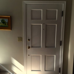
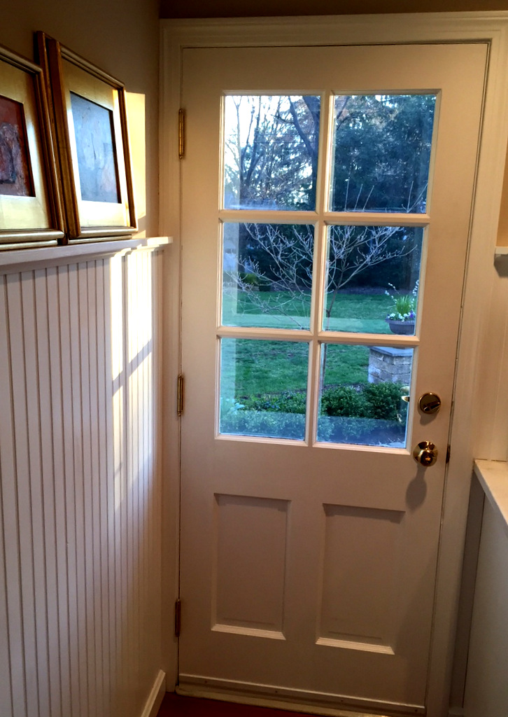
Morning sunlight streamed through the back kitchen door and something about the light gave me pause to look more carefully at the design of the door itself. An hour later those sun beams poured through a window above the front stair landing and did the same thing for the front door. I’ve been thinking about how traditional door designs are

There’s more to this six panel door than just a grid.
a mini text book on using proportions to create an attractive composition. It’s a given that both these door designs are driven by the functional requirements. That front door is solid wood, weighs more than a smart car, and has worked flawlessly since it was newly installed in 1949. There is no reason barring fire or gross neglect that it should not continue for another 300 years. But I’m interested in going deeper and trying to see the underlying proportional scheme below the surface.
Both doors employ a symmetrical layout with a mirror image on both left and right of a line running vertically down the center. But that symmetry is complimented by an asymmetrical layout as your eye moves vertically from top to bottom. Note that the kitchen door is organized around two large underlying rectangles. A minor rectangle on the bottom (solid structure) that plays off the major rectangle (window space) above it. The front door panels are arranged in a tripartite sequence spelling out a visual beginning, middle, and ending. Note that those panels in a vertical sequence of three are not identical but vary in height. Again you have layers of minor and major complimenting one another. This traditional play of proportions is so common we might easily overlook it. Yet it holds something interesting we can apply to furniture designs.
George R. Walker


One thought on “Morning Sun, front and back”
Sverre
As someone who has installed a number of doors in my time, I have always been partial to the reliable “6 panel oak” door. I’ve never considered doors from a design perspective, however, until I read this blog entry. I own and have read all your books, and this entry illustrates that when it comes to applying the design principles contained therein, the possibilities are endless.